A SHINY NEW BANNER

Everyone's got fancy new header banners. After designing one a couple of weeks ago for Coturnix' new A Blog Around the Clock, it didn't even occur to me to do the same for my own blog, until Carl Buell, aka Olduvai George, who recently designed a beautiful new banner for Stoat, made the suggestion. "Good idea!" thought I, and I went to work, with the above result. What do you think? Does it load quickly enough for those with dial-up connections? I still have a bit of fussing to do with it. A million thank-yous to Beth of Firefly Forest for her technical advice.
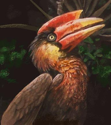
The original artwork is acrylic on illustration board, 3” x 15¾”. Click on the pic above for a closer look. Here's a list of the organisms depicted, from left to right:
Horsfield's Tarsier (Tarsius bancanus), Great Philippine Hornbill (Buceros hydrocorax), Traveller's Tree (Ravenala madagascariensis), Northern Tamandua (Tamandua mexicana), Long-tailed Paradise Whyda (Vidua interjecta), Spotted Flying Lizard (Draco maculatus), Bhutan Glory Swallowtail (Bhutanitis lidderdalii), Chinese Tiger Beetle (Cincindela chinensis), Leaf-cutter Ants (Atta cephalotes), Red Cicada (Tibicina haematodes), Dark Pitcher (Nepenthes fusca), Drill (Mandrillus leucophaeus), Horned Marsupial Frog (Gastrotheca ceratophrys), Proboscis Bat (Rhynchonycterus naso), Long-tailed Pangolin (Manis tetradactyla), Secretary Bird (Sagittarius serpentarius), Green Tree Monitor (Varanus prasinus), Flammulated Owl (Otus flammeolus), Common Golden-backed Woodpecker (Dinopium javanense).


14 Comments:
A delightful banner! Some of the animals, like the hornbill, are so expressive. I understand the urge to re-edit... it's sometimes harder to make things for ourselves than for others. I'm glad to see you're willing to treat yourself, though.
I've got to say, your banners are absolutely wonderful. I wish there was a link to a higher-res version so we could look at them more closely (both your own and the one you did for coturnix).
Gorgeous! I clicked on the image at the top of this post (not the top of the screen) to see it in its large-size splendor! Amazing!
D'oh! I didn't even notice the image was hotlinked.
The banner is terrific. It does load a little slowly for me -- but I have the world's worst dial-up connection (Oh, the perils of living out in the sticks where the phone lines are old and decrepit!). However, the text of the page downloads immediately, so I can just start reading as the banner appears. It'll be cached after this visit anyhow. I'm sure it must download quickly for everyone else!
Now THAT'S A BANNER!!!!
Absolutely beautiful Carel. You shouldn't have identified the critters however. You could have had a contest to see how many of us fans could find and name all the species.
That's a great banner. It loads fine for me; then again I'm on DSL.
Very cool. I like thisone even more than the one you did for Coturnix.
You are a man of such creativity! Now, do one for me! (wink)
Thanks to everybody for your input. I was probably setting up the link to the larger version at about the same time that Neuralgourmet was typing a request for it.
Your banner is full of life and excitement even in its stillness. It is true to the title "Life Unyielding". The only thing that I personally would enjoy more would be if it were as LARGE as possible, clear across the top of the page, from one side to the other(like a ticker tape) suggesting the spirit of the continuum of life...as well as your good work.
I agree with everyone else on how great your new banner is and how much better it would be were it bigger. Maybe you can make the link to the larger image a permanent feature of your sidebar.
Anyway, nitpicking is an inappropriate reponse to your consistently excellent art. You are a master of your own particular idiom (nod to Monty Python!)
Stunning! I can almost hear it.
Some good suggestions. i will experiment in the coming days with a larger banner. The color is also too green; I have to work on bumping the reds.
Post a Comment
<< Home